A couple weekends ago I went to the Big Design Conference in Dallas (recap coming soon), and I always come back inspired to help the user’s experience with the applications I write. One of the things mentioned (several times) was making forms simpler. Basically, you don’t have to make the end-user feel like they’re filling out a form. There are ways to make it seem less intimidating. One way is to swap out the typically hard-to-click checkbox or radio button with an image. It gives the user a larger click area and it looks nice…at least in my opinion.
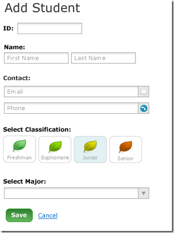
Basically, I’m helping a friend with a small project, and the image below is what I wanted to create.
If you buy Stephen Anderson's book "Seductive Interaction Design", you will see a similar form to the one above...primarily just the name and contact info stuff. By the way, I definitely recommend this book.As you can see, the “Select Classification” is not your typical radio button setup. I googled for a bit if there was already a jQuery plugin to do this type of thing and came up empty. I’m sure you almighty readers know of one, but I couldn’t find it…so I made one.
So far I’ve tested it in Firefox, IE9, Chrome, and JAWS, and it works pretty good in all of them. The way I set it up to work is based on the input and label. So you’d have the most accessible standard markup with your preferred styles for the label, and that’s how you get the effect shown above. I think it’s probably better said with code:
So it looks like a pretty typical setup so far, right? You have an input with a label. To make it more accessible, you wrap it with a fieldset and give it a legend. The primary reason you’d do this is to give screen readers some context. If you don’t need to worry about that, you could just as easy wrap it all with a div. You’re going to want to wrap it so your jQuery selector is more precise. After you markup the form, you just add the following JavaScript.
Now you’re all wired up, and you just add in your styles to whichever stylesheet classes you specified. The default stylesheet class names I specified are:
- .Selected-Checkbox – this class is added to the label after it has been clicked
- .Checkbox-in-focus – this class is added to the label when the checkbox/radio button is in focus
If you’re not sure the plugin is working properly, you can put it in “testMode”, like this:
$('#classification_radio_wrapper label').checkMate({testMode: true });
If you need to override my default class names, you can do that too by specifying class or focusClass in the options. I might rename class to selectedClass in the near future.
Please leave a comment if you have any questions or feedback.
The source code is available on github at https://github.com/derans/checkMate
The demo is located on 1pg.it at http://1pg.it/v9etvtn5 (also on github as the example.htm file)

